Effective design requires careful attention to design principles that ensure readability, visual appeal and a strong message.
Here are some key tips:
1. Clear Purpose and Audience Understanding
- Define the Objective: Know the purpose of your printed material. Is it to inform, promote, educate, or entertain? This will guide your design choices.
- Understand Your Audience: Tailor your design to the preferences and needs of your target audience. Consider their demographics, interests, and behaviours.
2. Strong Visual Hierarchy
- Headlines and Subheadings: Use clear, bold headlines and subheadings to break up the text and guide readers through the content.
- Focal Points: Designate focal points using larger fonts, bold colours or images to draw attention to key information.
3. Consistent Branding
- Brand Colours and Fonts: Use your brand’s colour scheme and typography consistently throughout the design. This reinforces brand identity and recognition.
- Logo Placement: Ensure your logo is prominently placed but not overpowering. Typically, the top or bottom corners work well.
4. Engaging Visuals
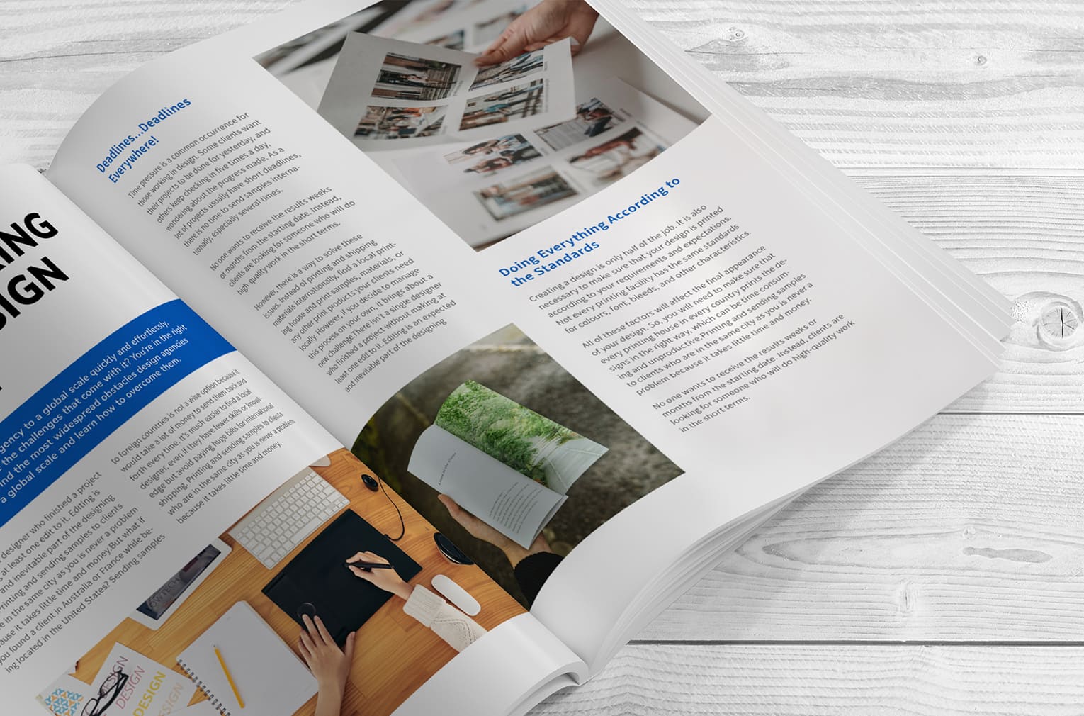
- High-Quality Images: Use high-resolution images that are relevant to your content. Blurry or low-quality images can detract from the professionalism of your material.
- Infographics and Icons: Incorporate infographics, icons, and other visual aids to break down complex information and make it more digestible.
5. Balanced Layout
- Grid System: Use a grid system to structure your layout. This helps maintain balance and alignment, making the content easier to read.
- White Space: Don’t overcrowd your design. Use white space strategically to avoid clutter and give elements room to breathe.
6. Readable Typography
- Font Choices: Select fonts that are easy to read. Use a maximum of two to three fonts to maintain consistency and avoid visual clutter.
- Font Size and Spacing: Ensure that font sizes are legible, especially for body text. Adequate line spacing (leading) and letter spacing (tracking) improve readability.
7. Compelling Copywriting
- Concise Text: Keep your text concise and to the point. Use bullet points and short paragraphs to make information easily scannable.
- Clear Call to Action: Include clear and compelling calls to action (CTAs). Make sure they stand out and prompt the reader to take the desired action.
8. Effective Use of Colour
- Colour Psychology: Understand the psychological impact of colours. Use them to evoke the desired emotions and responses from your audience.
- Contrast: Ensure there is sufficient contrast between text and background colours for readability.
9. Interactive Elements
- QR Codes and Links: Incorporate QR codes or website links for readers to easily access additional information or digital content.
- Contact Information: Make sure your contact information is easy to find and clearly displayed.
10. Print Quality
- Paper Choice: Choose the right type of paper for your material. Glossy finishes work well for high-impact visuals, while matte finishes are easier to read.
- Printing Techniques: Consider special printing techniques like embossing, foil stamping, or spot UV to add a premium feel.
Brochure-Specific Tips
- Tri-Fold Layout: For tri-fold brochures, design each panel with a specific purpose in mind. Ensure that the cover panel grabs attention and the inside panels provide detailed information.
- Clear Sections: Divide content into clear sections with headings to make it easy to navigate.
Catalogue-Specific Tips
- Consistent Product Layout: Use a consistent layout for product listings. Include high-quality images, clear descriptions, and pricing information.
- Index and Categories: Provide an index and categorize products to make it easy for readers to find what they’re looking for.
Magazine-Specific Tips
- Engaging Cover: Design an eye-catching cover that entices readers to pick up the magazine. Use compelling imagery and bold headlines.
- Feature Articles: Highlight feature articles with larger images and distinctive typography. Use pull quotes and sidebars to break up text.
Example Implementation
Brochure for a Tech Company: A tech company creates a tri-fold brochure for a new product launch. The cover features a striking image of the product with a bold headline. Inside panels provide detailed specs and benefits, with each section clearly separated. The back panel includes a QR code for more information and contact details.
Catalogue for a Fashion Brand: A fashion brand designs a seasonal catalogue. Each page follows a consistent layout with high-quality images, clear product descriptions, and prices. The catalogue is divided into sections (e.g., Women, Men, Accessories), each with a distinct colour theme for easy navigation.
Magazine for a Lifestyle Brand: A lifestyle magazine features an engaging cover with a vibrant image and a bold headline for the lead article. Inside, feature articles are highlighted with large images and pull quotes. Consistent use of fonts and colors throughout maintains a cohesive look.
By following these design tips, you can create brochures, catalogues and magazines that are not only visually appealing but also effective in communicating your message and engaging your audience.
EPM Print Group, as a long term, local Queensland business and market leading print solutions agency, can assist with brand management and growth right across Australia. With our own online management portal, you can take charge of all your printing needs from the comfort of your desk or mobile phone. If your business would like to be supported by a professional, reliable, cost effective business solution, reach out to our team at sales@epmprint.com.au
order enclomiphene generic version
ordering enclomiphene generic online cheapest
generique kamagra pharmacie livrer a domicile de medicaments
medicament kamagra prescrire eu medicament
purchase androxal cheap to buy online
cheap androxal us pharmacies
discount dutasteride cost usa
ordering dutasteride generic overnight shipping
buying flexeril cyclobenzaprine singapore where to buy
how to buy flexeril cyclobenzaprine uk online pharmacy
buy gabapentin canada generic
buy gabapentin uk order
over the counter sales of fildena in ireland
online order fildena australia no prescription
discount itraconazole no prescription overnight delivery
purchase itraconazole real price
purchase staxyn canada fast shipping
buying staxyn cheap alternatives
No perscription avodart
buying avodart australia where to buy
buy cheap rifaximin new york city
buying rifaximin cheap with prescription
purchase xifaxan using mastercard
buy cheap xifaxan generic when will be available
kamagra konzultace zdarma u.s.
kamagra levné noční doručení